Instagram is a powerful platform for sharing your message, growing your brand, and engaging with your audience. But if your content gets cropped or key text disappears, your hard work goes to waste. That’s where the Instagram safe zone 1080×1350 comes in. In this guide, you’ll learn everything you need to know about the safe zone, how to use it properly, and why it matters—so your content always looks perfect on the feed.
What Is the Instagram Safe Zone 1080×1350?
The Instagram safe zone 1080×1350 refers to the part of your vertical post that stays fully visible in the feed, without getting cut off or hidden behind buttons, captions, or Instagram UI elements. Instagram supports multiple post dimensions, but 1080×1350 pixels (a 4:5 aspect ratio) is one of the tallest and most optimized sizes you can use for single feed posts.
Now, while 1080×1350 is the full canvas size, the “safe zone” is slightly smaller. This invisible frame ensures all your important visuals—like text, faces, or product shots—are not placed too close to the edges where they risk being cropped on certain screens. Many designers recommend keeping vital content within a 960×1200 pixel area, centered in the middle. This ensures the post looks great on all devices and formats.
Why Safe Zones Matter on Instagram
Using the safe zone isn’t just a suggestion—it’s a best practice for anyone who cares about professional content. Instagram is mostly accessed via mobile phones, and even a slight shift in display sizes can impact how your image is shown. If your design has important information like call-to-action buttons, pricing, or brand logos near the edges, they may not be visible when someone scrolls through their feed.
Also, Instagram automatically crops previews of images when shown in grid view or on a user’s profile. So if you’re not designing with a safe zone in mind, your well-designed post might appear awkward, misaligned, or even confusing. By sticking to the Instagram safe zone 1080×1350, you avoid embarrassing mistakes and maintain a clean, professional look across every platform view.
Best Instagram Post Size for 2025
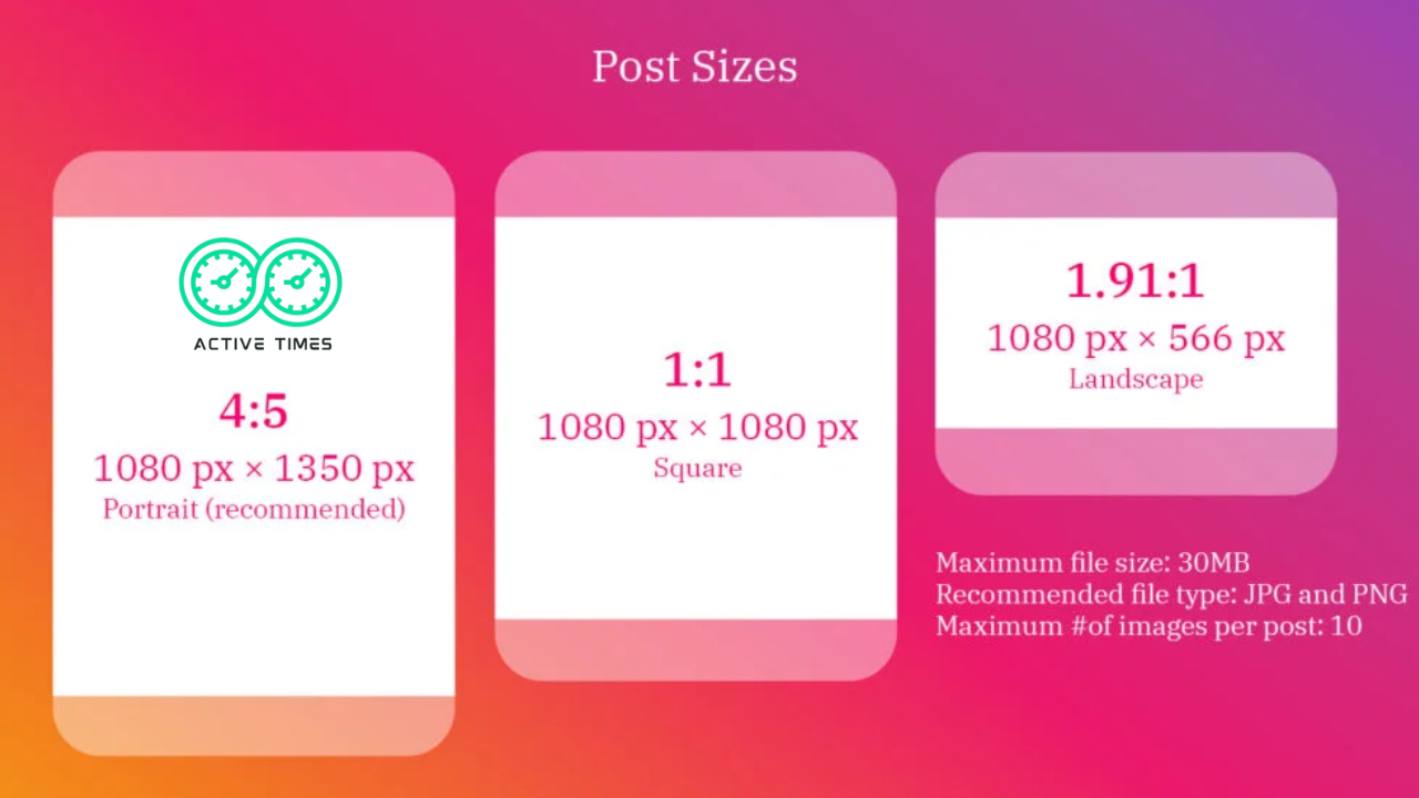
Instagram is constantly evolving, but as of 2025, the best size for Instagram posts remains 1080×1350 pixels for vertical images. This size is tall enough to grab attention in a vertical scrolling feed, yet compact enough to display cleanly on most mobile devices.
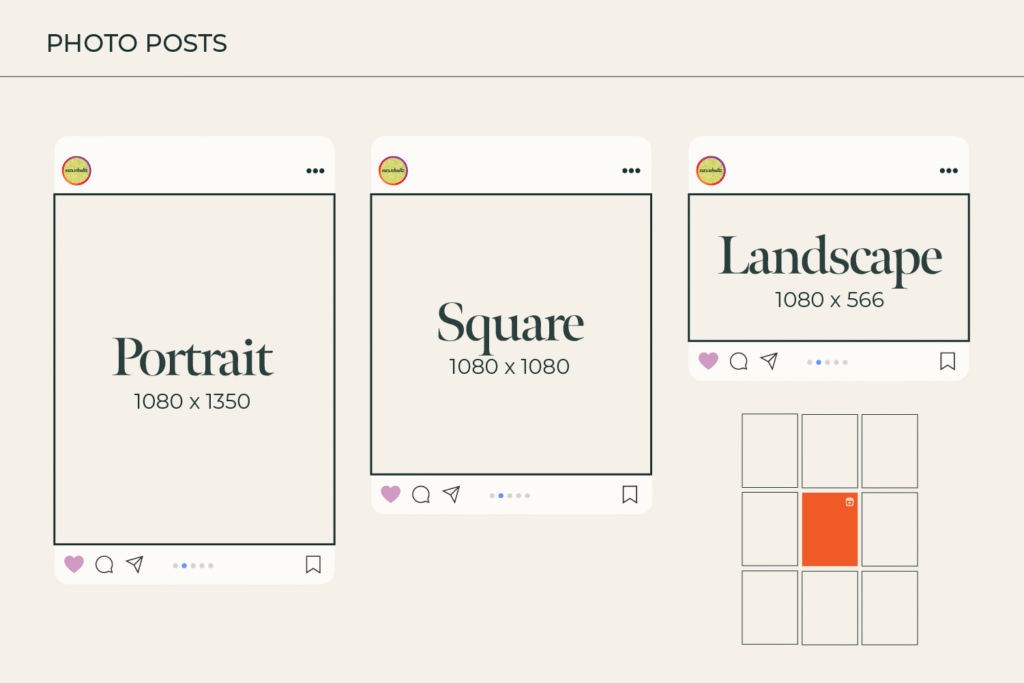
Instagram supports a few different post dimensions, such as:
- Square (1080×1080)
- Portrait (1080×1350)
- Landscape (1080×566)
Of these, portrait size (1080×1350) gives you the most screen real estate, allowing you to show more in a single image. It’s ideal for infographics, long captions, step-by-step visuals, and more immersive branding content. When you post in this size, you dominate the vertical space in the feed, which increases the chances of users pausing and engaging with your content.
Is 1080×1350 the Best Size for Feed Posts?
Yes, for 2025 and beyond, 1080×1350 is considered the most effective feed post size. It captures more screen space, improves visual impact, and aligns with the mobile-first nature of Instagram. If you’re creating feed content like photo shoots, product showcases, or educational posts, 1080×1350 is the smart choice.
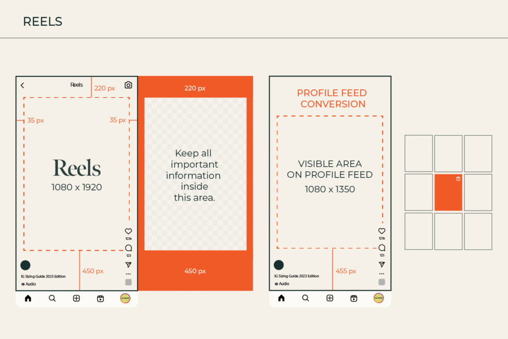
What About Stories and Reels?
For Stories and Reels, the ideal size is 1080×1920 pixels (9:16 ratio). This is full-screen vertical, designed to cover the entire screen on smartphones. While 1080×1350 won’t be optimal for these formats, you can still use similar design principles—especially safe zones—to avoid placing text behind UI elements like profile names, reply boxes, and music bars.
Can I Use 1080×1350 for Ads Too?
Absolutely. Many successful Instagram ads use 1080×1350 dimensions, especially for feed placements. It offers a good balance of visibility and quality. Just remember: even though it’s an ad, keeping important content in the safe zone ensures better performance. Ads that get cropped or look sloppy won’t convert. Whether you’re running lead gen ads or carousel promos, using the 1080×1350 size properly gives you a better chance of engagement.
Simple Tips to Keep Your Content Inside the Safe Zone
Designing for the Instagram safe zone 1080×1350 isn’t hard—if you follow a few simple tips. First, always use guides when designing. Apps like Canva, Adobe Photoshop, or Figma let you place custom guides at key pixel distances (like a 60-pixel margin from each edge) to define the safe area.
Here are quick rules to remember:
- Keep important elements (text, faces, logos) inside 960×1200 px centered zone
- Leave some padding near the top and bottom to avoid Instagram UI overlapping
- Use preview modes before publishing to check how your image appears on grid and feed
- Export in high resolution (72 DPI minimum) for sharp display
- Avoid compressing images too much—Instagram already compresses on upload
The more you respect these basic boundaries, the better your posts will perform across all devices.
How to Design Posts with Safe Zones in Mind
Designing with safe zones starts from your planning stage. When you’re sketching out your content idea, think about what the user will see in the first 1–2 seconds. Your focal point should be centered, not pushed too far up or down.
Use these creative techniques:
- Text Hierarchy: Place headings in the center and supporting text underneath—don’t stack too high or low
- Smart Framing: Use image framing to “guide” the viewer’s eyes toward the center
- White Space: Don’t fill every pixel—let the design breathe so nothing feels too tight
- Color Contrast: Make sure your text color stands out against the background inside the safe zone
Safe zone-conscious design makes content feel more intentional and boosts your post’s chances of grabbing attention—even with fast scrollers.
Common Mistakes to Avoid When Using 1080×1350
Even though 1080×1350 is the recommended size, many creators make common errors that hurt their engagement or ruin their visuals.
Watch Out for Cropping on the Feed
Instagram sometimes crops portrait images when displaying them in grid views or shared previews. If your key content sits near the edges, it may get trimmed. Always test how your post looks before going live—especially in the square thumbnail view.
Don’t Ignore Mobile View
Most people scroll Instagram on their phones. What looks good on desktop might not translate on mobile. Make sure to test mobile previews and adjust layouts accordingly. Tiny fonts, poorly aligned images, or overlapping elements can turn off viewers instantly.
Tools to Check Your Instagram Safe Zone
Many free and premium tools can help you visualize the Instagram safe zone 1080×1350 before posting. Here are a few popular options:
- Canva – Offers Instagram templates with safe zone guides
- Figma – You can create your own grid overlay
- Adobe Photoshop – Allows custom guide placement for safe zone awareness
- Crello – Provides design-safe margins for Instagram posts
- Snappa – Easy drag-and-drop tools with built-in social media templates
Using these tools can save time and prevent mistakes, especially for brands or influencers who publish often.
Thoughts: Keep It Clean, Keep It Safe
In the world of social media, first impressions are everything. A clean, well-aligned post in the right size with smart use of the safe zone can dramatically boost how people interact with your content. It shows you care about quality, you’re detail-focused, and you’re not just throwing things online for the sake of it.
Consistency across your posts helps build brand trust and visual identity, which leads to more likes, comments, shares—and results.
The Bottom Line
Understanding and using the Instagram safe zone 1080×1350 is a small step with big rewards. Whether you’re a beginner trying to grow your page or a brand managing a campaign, following the best practices for post size and safe zone design ensures your content always looks polished and professional.
By keeping your key content within the safe zone, using the right post dimensions, and avoiding common mistakes, you stand out in the sea of posts and make every pixel count.